Snow, snow, look at the snow. This is a line from a pre-school first reader book and the last economic indicator reports are quite similar. All of a sudden everything is blamed on the weather, in a repetitive, rhyming pattern.
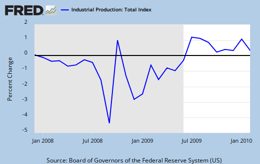
The Federal Reserve has released Industrial Production & Capacity Utilization for February 2010. Graph-o-rama below.
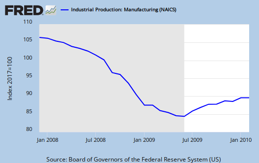
Industrial production edged up 0.1 percent in February following a gain of 0.9 percent in January. Production was likely held down somewhat by winter storms in the Northeast. Manufacturing decreased 0.2 percent in February, with mixed results among its major industries. The output of mines rose 2.0 percent, while the index for utilities rose 0.5 percent. At 101.0 percent of its 2002 average, industrial output in February was 1.7 percent above its year-earlier level. Capacity utilization for total industry moved up 0.2 percentage point to 72.7 percent, a rate 7.9 percentage points below its average from 1972 to 2009.

Firstly, if one notices, we're back to 2002 Production Index levels.
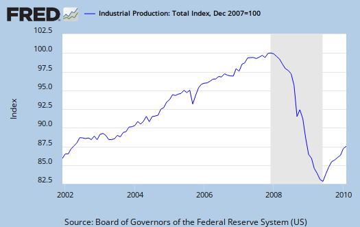
The headline buzz was astounding, all proclaiming the great news of a 0.1% increase, implying manufacturing is increasing. Obviously not so, since manufacturing just declined and the 0.1% increase due to 2.0% increasing in mining and then a 0.5% increase in utilities.
Capacity Utilization is flat in comparison to January (so is the overall Industrial Production index).
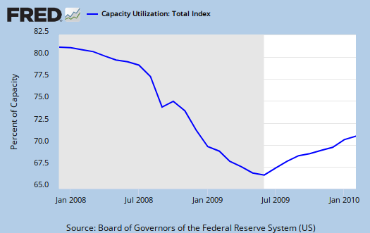
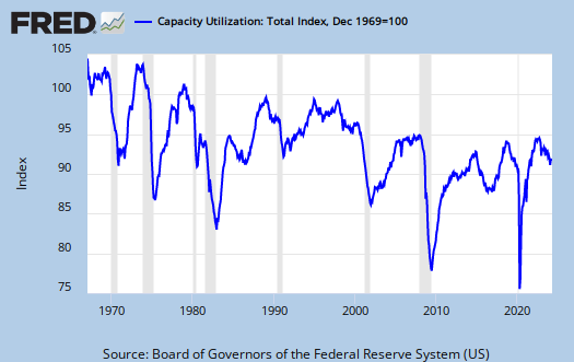
The below graphs show the overall decline of U.S. capacity utilization. It's horrific now, but look at the long steady slope down, which shows the U.S. is simply not producing what it is capable of, Economic Armageddon o no.
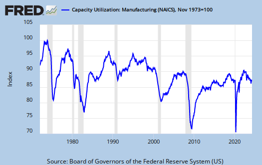
Manufacturing is even more dramatic:
The reason this post is a day late is I use, heavily (and God love 'em, it's the best darn online data!), the St. Louis Federal Reserve FRED and their database wasn't updated on these particular data sets. Even better, I emailed them and they responded and corrected the problem. Who says the Fed is all bad, not these guys. Best darn tools out there for online analysis!
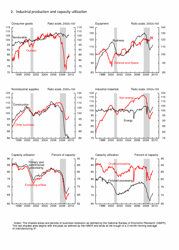
That said, the attached report has additional breakdowns in graphs. One to look at is construction, just a dead duck industry sector at this point. Laying flat, dead, no resurrection happening soon type of graph.
Update:
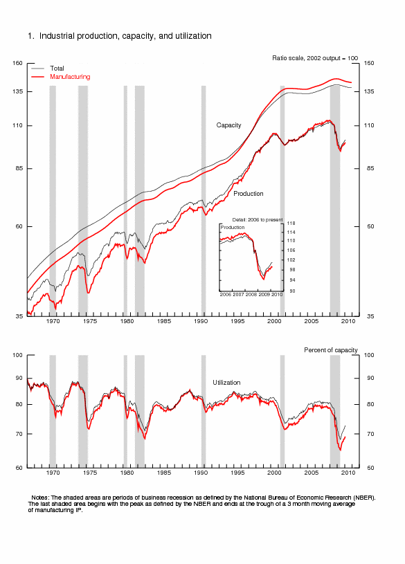
As mentioned below and this is the best quick graph I can get of it, actual capacity, versus percent utilized, has dropped in this recession.
Subject Meta:
Forum Categories:
| Attachment | Size |
|---|---|
| 225.38 KB |

Capacity
Keep your eye on capacity as opposed to utilization. It continues to drop this month as it has for every month since the beginning of 2009. This is an unprecedented situation. Never in the two hundred years before the last recession did the US lose capacity to produce.
This is the great missed story of this downturn.
So right Jehu
I quickly added the best graph I could locate, without downloading the raw data and making one. It does appear actual capacity also dropped earlier in the decade...
the question is I think we could correlate that drop to manufacturing moving to China and services as well moving to India, but this time, is that so, or is it pure downturn?