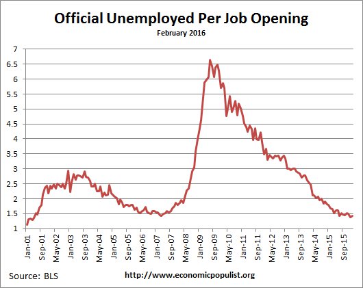
The BLS February 2016 JOLTS report shows very high job openings once again. Job openings have more than recovered from the recession and now job openings are greater than the number of new hires. Actual hiring has also reached prerecession levels and is at a nine year high. The Job Openings and Labor Turnover Survey shows there are now 1.4 official unemployed per job opening for February 2016. Job openings and hires were both 5.4 million. The bottom line is all of those who dropped out of the job market should consider coming back for clearly demand for workers is finally very strong.
There were 1.8 official unemployed persons per job opening at the start of the recession, December 2007. Below is the graph of the official unemployed per job opening, currently at 1.44 people per opening. This ratio hasn't been seen March 2007.
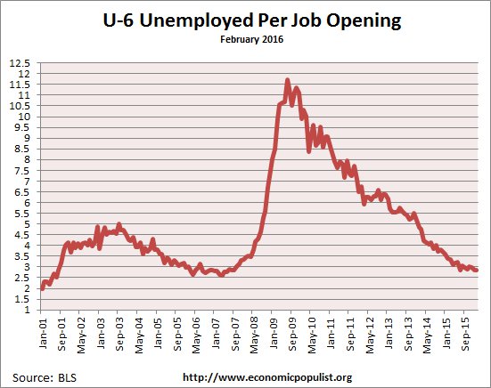
If one takes the U-6 broader measure of unemployment that includes people who are forced into part-time work and the marginally attached, the ratio is 2.86 people needing a job to each actual job opening. In December 2007 this ratio was 3.2. Here too we see ratios returned to prerecession levels.
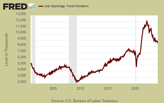
Job openings for the past year have exceeded hire levels which is not the case for most of the survey's history. Currently job openings stand at 5,445,000.
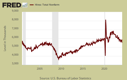
Below is the graph of actual hires, currently 5,422,000. We can see hires have finally recovered to pre-recession levels. More interesting in June 2009, the height of the recession, hires exceeded job openings by 1.2 million. Yet since February 2015, job openings have exceeded hires and in February 2016, hires exceeded openings by 23,000. This shows great demand for workers, although tech companies and now other sectors are notorious to put out fake job openings in order to claim they have a labor shortage and thus demand more guest worker Visas in order to import cheap labor. This undercuts and displaces those workers with U.S. citizenship.
Graphed below are total job separations, currently at 5.05 million. The term separation means you're out of a job through a firing, layoff, quitting or retirement and is also called turnover. From a year ago, separations were 4.74 million.

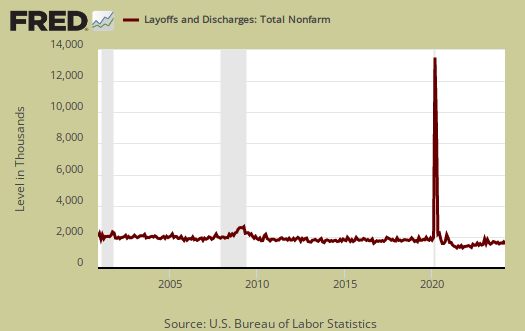
Layoffs and firings were 1.715 million. Below is a graph of just layoffs and firings. One can see from labor flows businesses are not thrashing their workforce as much, relatively speaking, starting in 2015. Labor flows means the way people are hired, stay at a job, quit, get fired, get another job and so on. It is the overall flow of the labor market for as people are get jobs, they also lose them.
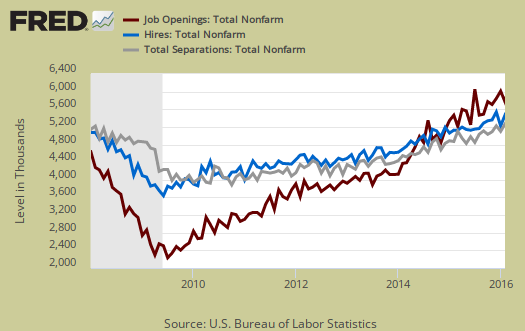
Graphed below are openings, separations and hires levels, so we can compare the types of labor flows. Labor is not static as people flow in an out of jobs. The level of unemployed in February was 7,815,000, so we can see hires and openings is a strong percentage of official unemployed at this point.
Graphed below are people who quit their jobs minus those who were fired and laid off. The lower the bar on the below graph, the worse labor conditions are. Quits are what they sound like, workers quit their current jobs often to obtain better ones. People feeling free enough to leave their current positions is considered a positive labor market sign. Quits were 2.95 million. A year ago quits were 2.7 million and quits are now near prerecession levels.

Below is a graph of the quits to layoffs ratio, currently at 1.7 and hasn't changed much. This ratio of people who quit their jobs vs. those who were fired gives an indicator of worker churn as well as if there might be a shortage. If the ratio is below 1.0, this means more people are being laid off and fired than people who quit. When the ratio is much higher, this means more people quit their jobs and thus implies there is better opportunity elsewhere and workers feel free enough to move on to obtain those new better jobs. The quits to fires ratio was 1.9 in 2006.

For the year, there was a gain of 2.7 million employed and in spite of different employment reports the net job gains hasn't changed in the last nine months. The duration in so called permanent jobs these days is very low, so due to labor flows the net gain of jobs over time belies the monthly headline buzz of jobs gained from the employment report. From the JOLTS report:
Over the 12 months ending in February, hires totaled 62.1 million and separations totaled 59.4 million, yielding a net employment gain of 2.7 million. These totals include workers who may have been hired and separated more than once during the year.
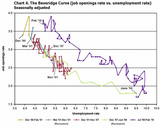
The BLS publishes highlights in a separate report and the beveridge graph is now most telling. Another interesting graph is the BLS generates Beveridge Curve. The Beveridge curve shows the official unemployment rate vs. the job openings rate, over time. If you see a bunch of data points to the far right, that's bad, it means there is long term unemployment and not enough jobs. Up and left in the Beveridge curve is good, it means there are jobs, people are getting hired, life is good. A right and up move in the Beveridge curve can indicate a skills mismatch. The green, representing the 2009 time period, shows how fast we went to the right. The purple line is 2010-2016 and is finally back top left. The left upwards portion of the graph which would indicate a healthy job market. The red line, which wasn't that great of a labor market, is pre-recession. The graph shows things are finally really improved, a true recovery. It has taken forever and one has to wonder what happens if those wiped out by the great recession jumped back into the job market, yet this is by far the best we've seen this graph in the last decade.
For the JOLTS report, the BLS creates some fairly useful graphs beyond the above and they have oodles of additional information in their databases, broken down by occupational area. That said, one doesn't know if the openings are quality jobs from the JOLTS statistics.
The JOLTS takes a random sampling of 16,000 businesses and derives their numbers from that. The survey also uses the CES, or current employment statistics, not the household survey as their base benchmark, although ratios are coming from the household survey, which gives the tally of unemployed.
The February 2016 unemployment rate was 4.9%. U-6 alternative unemployment rate was 9.7%. JOLTS includes part-time jobs and does not make a distinction between part-time, full-time openings. A job opening reported to the survey could literally be take out the trash twice a week and be counted. This is a shame, it would be nice to know a little more about the quality of these new opportunities. Here are our past JOLTS overviews, unrevised.

BLS data discrepancy
subtracting the 5,050,000 total separations from the total hires of 5,422,000 would imply an increase of 372,000 jobs in February, somewhat more than the revised payroll job increase of 245,000 for February reported by the March establishment survey a week ago, suggesting that one of these surveys might even be off by more than the expected +/-115,000 margin of error..
rjs
different survey
JOLTS is a separate survey so we cannot add and subtract the employment report from their figures. They do match up on the annual last I checked.
JOLTS total different than CES total
i wasnt mixing surveys; i was subtracting JOLTS separations from JOLTS hires to get the JOLTS equivalent of the payroll jobs increase...you're right, annually they tend to match. but they didnt in February...
rjs